Baby Boomer Demographics: The Shift Ahead
I've been maintaining a set of these pyramids to give us snapshots at 10-year intervals spanning seven decades. My pyramids differ from the ones available at the Census Bureau website in one key respect. The CB pyramids are based on population numbers by gender for each five-year cohort whereas mine are based on percentages. Why? Because, in the absence of an overpopulation problem, the shifting ratios over time are more important than the actual numbers. By using percentages on the horizontal axis, all pyramids add up to 100%.

The chart above is a snapshot of the U.S. population 30 years ago in 1982. I've highlighted the top of the Boomer cohort, generally defined as those born during the inclusive 19-year period from 1946 to 1964. By selecting 1982 as our start date, the oldest Boomers have completely filled the age 30-34 bar in our chart and occupy the three bars below, with Generation X slipping into the bottom of the age 15-19 cohort.


The movement of the Boomer bulge up the pyramid is obvious, as is the fact that it diminishes in size as mortality rates increase. The pyramid goes from a significantly lateral shape in 1982 to an increasingly vertical arch six decades later. At present and for the next decade, our pyramid is more of a "house" shape. The greater female longevity is readily apparent.
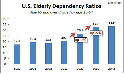
Let's look at some comparative numbers for these seven snapshots. I've calculated the Elderly Dependency Ratios for each using the standard formula: The percentage of the population age 65 and over divided by the percentage age 15-64 multiplied by 100 (see note at bottom).

The elderly dependency ratio has major significance for U.S. budget planning. As this ratio shifts higher, the productive population is increasingly burdened by the cost of entitlement programs for the elderly.
Interestingly enough, it was 1982, the very year of our first pyramid chart, that President Reagan appointed the National Commission on Social Security Reform (aka the Greenspan Commission after its Chairman) to address the mounting financial problems of the Social Security system. The outcome included the gradual increase in the normal retirement age and taxation of benefits.

My annotations on the dependency ratios chart above suggest that we are approaching a threshold of increasing demographic burden on the financial system. The ratio has only increased 16.7% in the three decades from 1982 to 2012. But the rise from 20.4 to 26.8 over the next ten years is a 31.6% increase followed by a 21.8% increase over the following ten years.
At present, those of us who follow the economy and financial markets are looking for evidence that European sovereign debt issues won't trigger another international financial crisis. How that plays out remains an uncertainty. In contrast, we can be very certain that our accelerating demographic shift will continue to increase the political debate on entitlement expenditures, especially on the eve of a presidential election.
Despite the current focus in the U.S. on stimulus (aka "Quantitative Easing"), lurking in the wings are demographic changes that will ultimately take center stage in the financial planning of federal, state and local governments. The process will increasingly affect individuals as we adjust our retirement expectations and strategies for insuring income during our elder years.
Link -
http://seekingalpha.com/article/877651-baby-boomer-demographics-the-shift-ahead?...================================
In fact, there are quite a few variables, involved in the current Global Economic crisis!
However, one of the MOST significant is that it took all from the dawn of human history until around 1800, too get to ONE Billion people Globally.
By around 1930, the Global Population doubled to TWO Billion!
By the mid 1970's it doubled again to FOUR Billion!
Now, in 2012, we have a Global Population of just over SEVEN Billion!
There are a few other MAJOR factors influencing events, but the massive Population increase has sat quietly in the background, DRIVING the Economics of Demand & Supply.
That Exponential Population Growth is now grinding to a halt, in the US & Globally and as it does the old Economic rules of the "modern era" will become "Null & Void"!!!
Just for comparison, following is the standard/usual Population pyramid -

One of the other major current influencing factors is the reality of Energy Demand/Supply Economics.
In this respect, since around the turn of the century the P/barrel Oil Price has gone from $10, to $147, down to $40 & back up to $100 or so.
IMO the Oil Price will again Decline, as the Global Economy goes into another Severe Recession. However, that Price drop will only be for a limited time, until it becomes apparent that Oil Production is not expanding to keep up with Population & Economic needs and then it will again take off & then it will simply keep going!
Btw, Saudi may still have some spare Production capacity, but only for a limited time and pretty much all other countries & fields are already in a Depletion phase. The Saudi's must also be joining that club soon, as theirs may be the biggest fields, but they are also the oldest!

 Forum
Forum

 Home
Home 

 Album
Album 

 Help
Help

 Search

 Recent

 Rules
Rules 

 Login
Login

 Register


 Pages:

