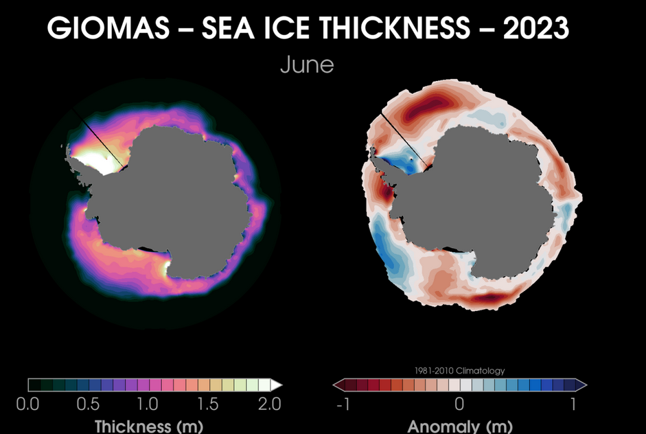
The charts below are produced by Zach Lane, a NOAA scientist.
The first chart tells a completely different story to the media narrative of a melting Antarctic. As you can see, most of the sea ice is actually thicker than normal. This is clear evidence of the ice edge being pushed polewards, squeezed closer together if you like:

https://zacklabe.com/antarctic-sea-ice-extentconcentration/
The second image shows that, although ice volume is much less than average, it is NOT the lowest on record. The record low appears to be from the 1980s, though it is not clear which year.
What is noticeable though is that, apart from this year, most of the low volume years are coloured blue (1980s and 90s), whilst the top years are all recent:

The final chart is most the revealing of all. We can clearly see that the lowest volumes were around 1980 and 1981; also the trend was steadily increasing till it hit a record high in 2014. This was followed by the drastic drop in 2016, when, according to NSIDC, the SAM flipped. Since 2016, little has changed in overall terms:


 Forum
Forum

 Home
Home 

 Album
Album 

 Help
Help

 Search

 Recent

 Rules
Rules 

 Login
Login

 Register


 Pages: 1

